
Whilst the page may seem visually pleasing, there are some areas which could be improved to help make the content more accessible.
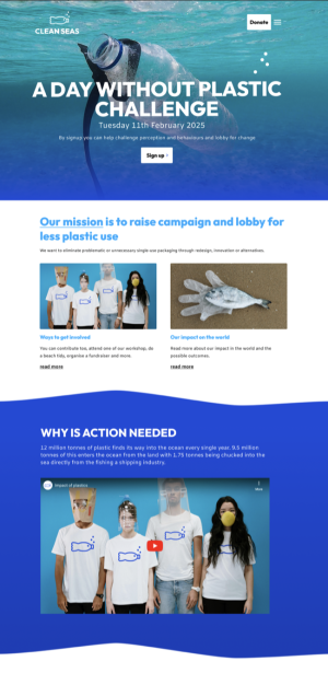
Let’s take a closer look at each of the sections in turn, starting with the header area.
Header: improving navigation, colour contrast, and legibility
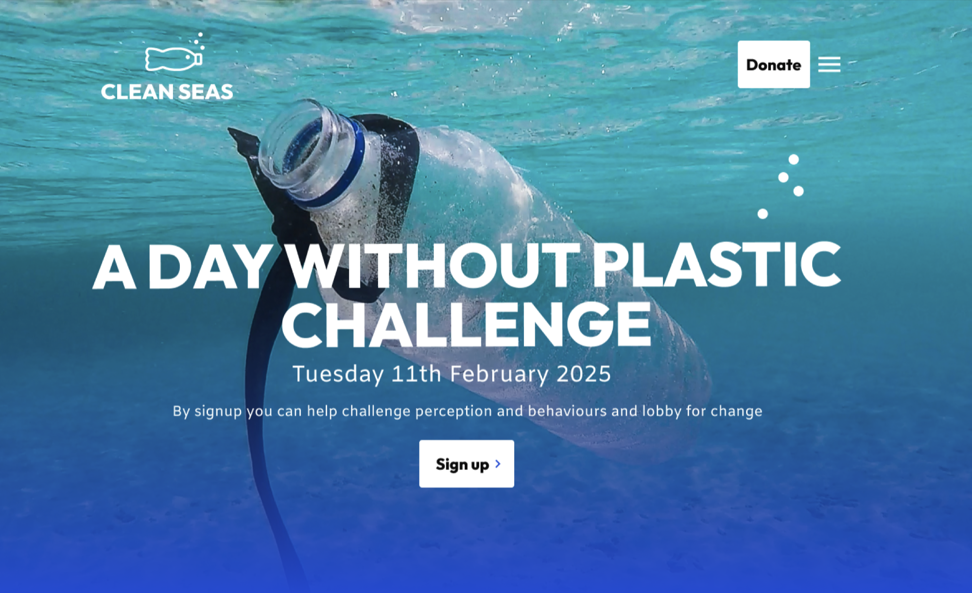
Header before accessibility improvements
In the top right corner, you’ll see that the site menu is hidden, and the user would need to click on the three horizontal lines to access the rest of the website navigation.
It’s common to hide key navigation links within a menu like this (sometimes called a hamburger menu) for smaller mobile phone screens. So it can be tempting to do this on wider screens too, for a clean aesthetic. This is problematic for your users because you’re making them work harder to find your content and get them to where they need to be.
Full-width images like the one used in the header can provide impact, but can also cause issues with text readability. In this example, the colour contrast of the text against the background image isn’t good enough to meet accessibility standards. The organisation’s logo is arguably getting lost as well.
Full uppercase sentences may be part of the organisation’s branding and therefore unavoidable, but it’s worth being aware that they are harder to read for users. Restrict uppercase lettering to short sentences and headings if you are going to use it.
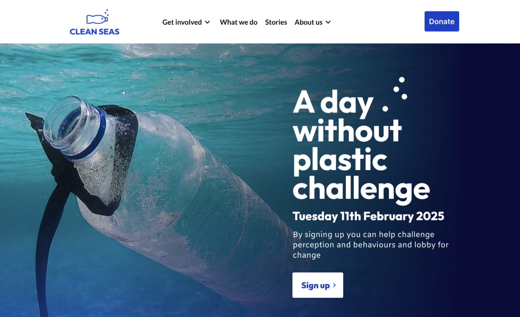
Header after accessibility improvements
Showing the full navigation on a plain background colour gives prominence to the company logo, and makes it much easier for people to see where to find the content they need.
We’ve moved the hero heading text to the right and added a dark blue gradient to that section of the image to improve the colour contrast and make it much easier to read, whilst retaining that impactful image.
And we have changed the heading from all uppercase to sentence case, without losing any of the impact of the statement.
Let’s now look at the middle section of the example homepage.
Middle section: improving link text, colour, and line length
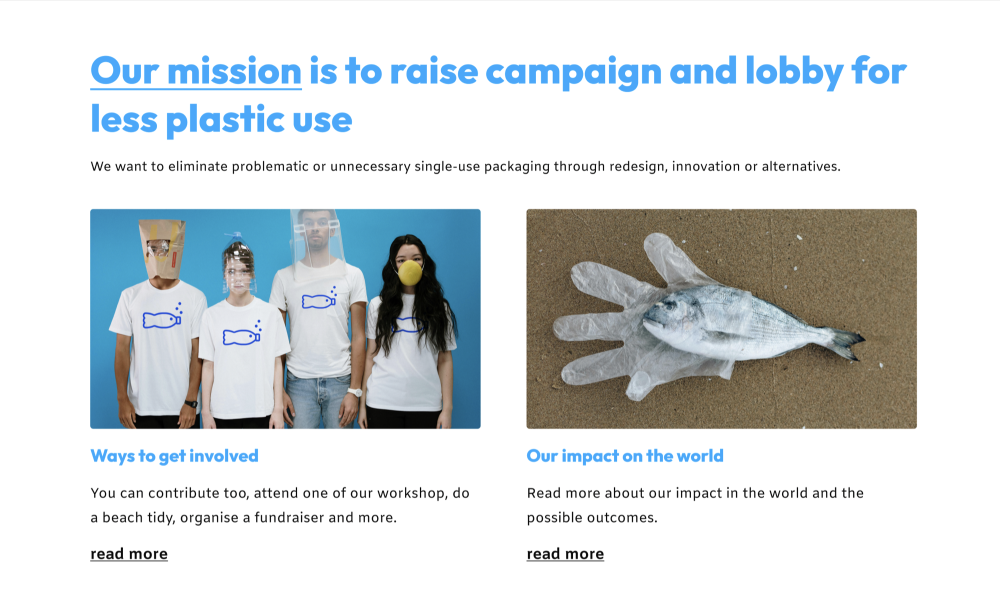
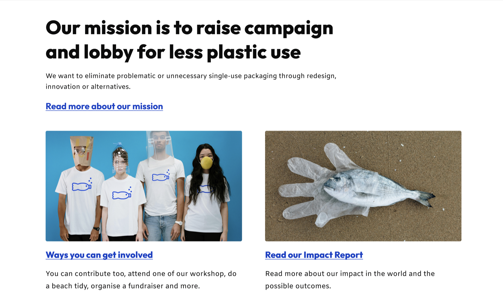
Middle section before accessibility improvements
Let’s now look at the middle section of the example homepage, where we have a heading, and some featured content that links through to other pages on the website.
The light blue text in the heading and subheadings doesn’t have enough contrast against the white background, making it hard to read.
The ‘read more’ links beneath the images are very generic and the same for both, even though they link to different pages. This isn’t just a problem for screen reader users; generic links affect sighted people too, as you have to read much more of the surrounding content to understand what the links are for. This can be particularly frustrating for people who are trying to find information quickly.
Middle section after accessibility improvements
The improvements here are subtle but make a big difference. We’ve used a darker colour for the headings and links to make them easier to read. And we have amended the link text so it clearly describes the purpose of each link.
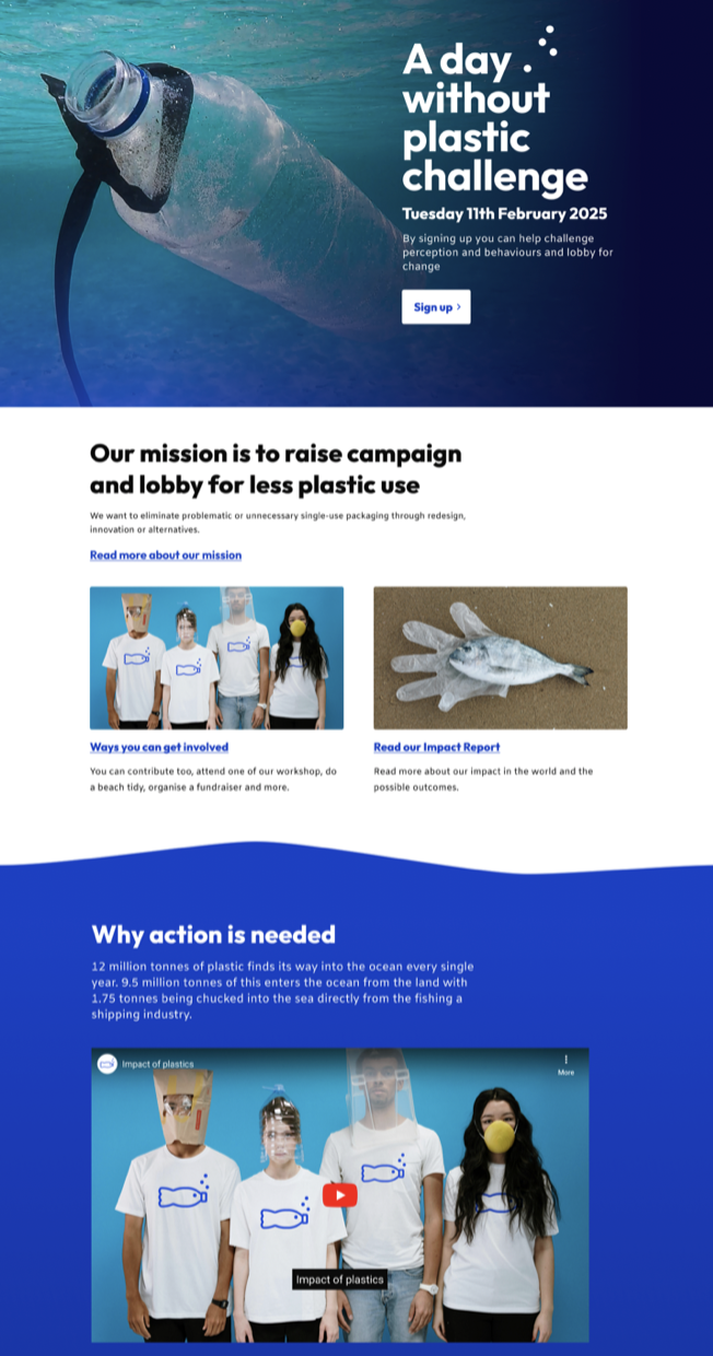
In the final section of the homepage we have some video content.
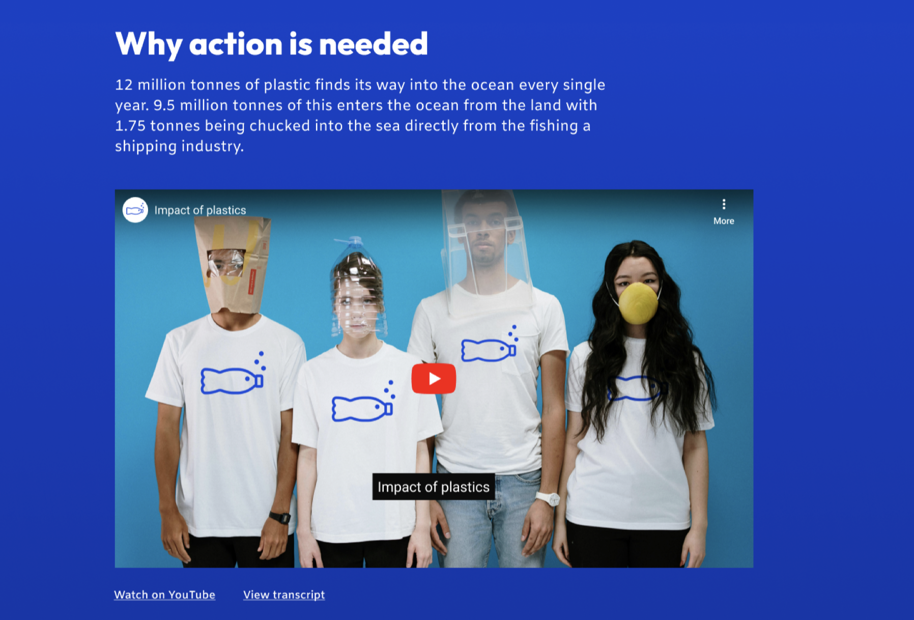
Video section: adding captions and transcripts
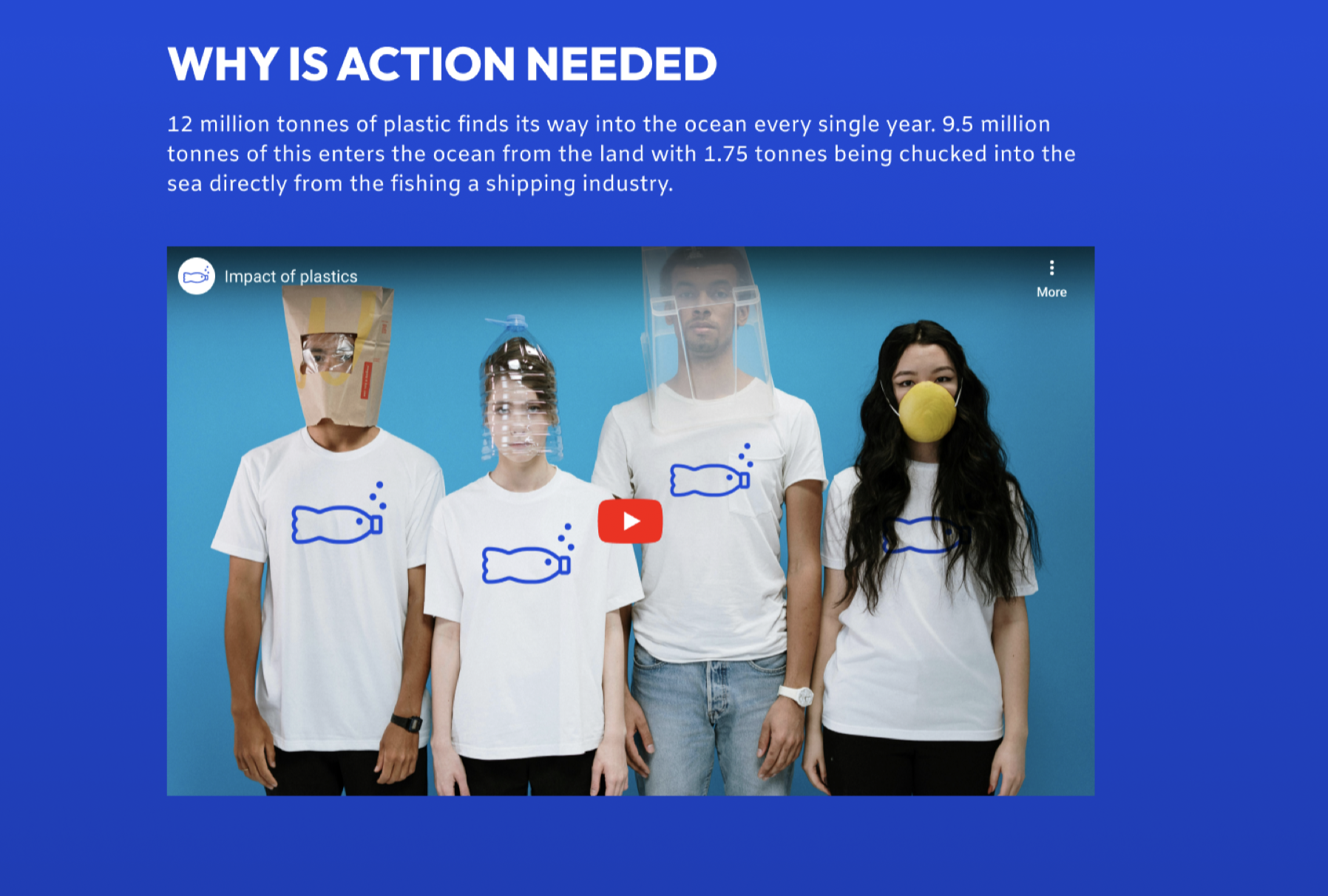
Video content before accessibility improvements
Again, we have the uppercase text for the heading, and there is no indication that the video has captions or a transcript.
Video content after accessibility improvements
We’ve made some small changes, but they have a big impact on the accessibility of this website. We’ve changed the heading to sentence case to make it easier to read, and we have provided captions for the video and included a link to the transcript.
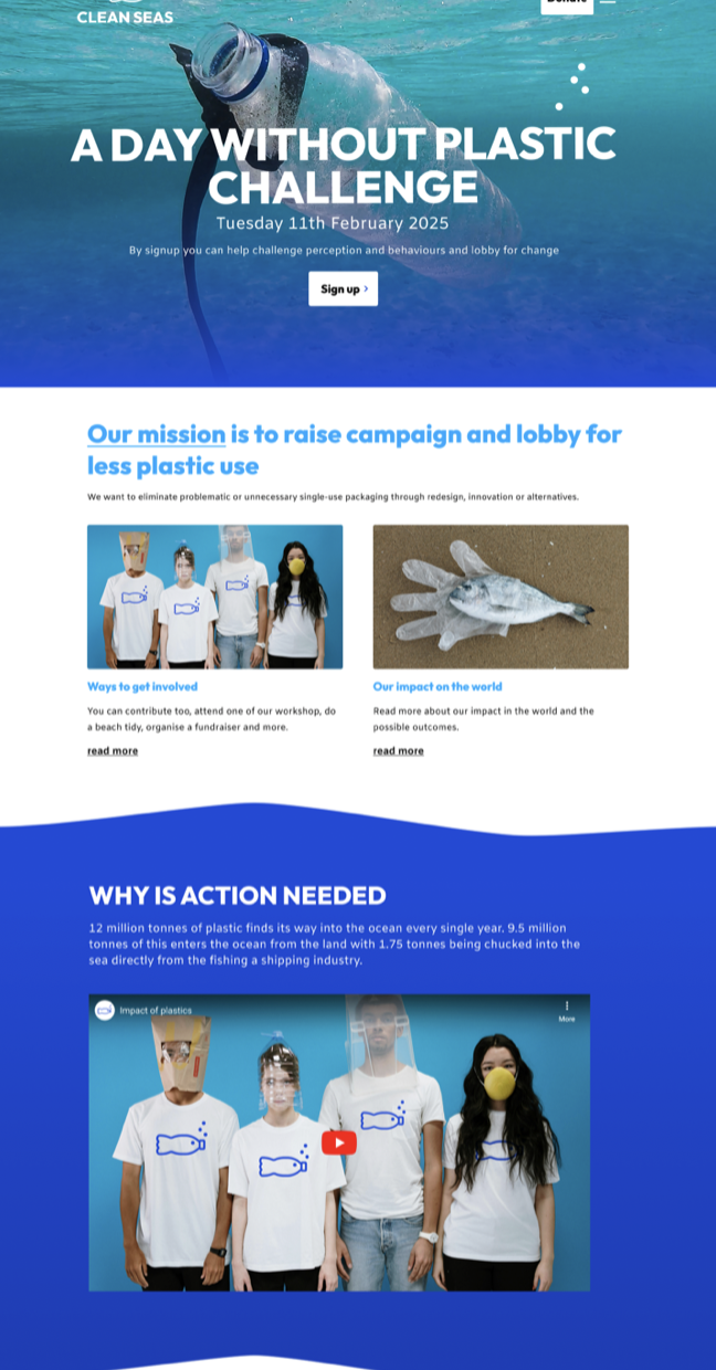
Before and after
Hopefully, this quick example has shown you that making changes to improve the accessibility of your website doesn’t mean you need to completely redesign your website. With a few targeted changes, you can make your site more usable for so many more people.
If you want help with text content, colour contrast, descriptive links, video content and more, read our guide to accessible content.
Here’s a reminder of how the homepage looked before, and how it looks with the accessibility improvements. That’s better!
Understand accessibility on your website
In our single-page accessibility review, our team of accessibility experts will identify where you have high-impact issues. We’ll explain the problems these cause for your visitors and offer recommendations on how to fix them. Use the review to start planning improvements.
Tell me more about the accessibility review(This will open in a new window)