
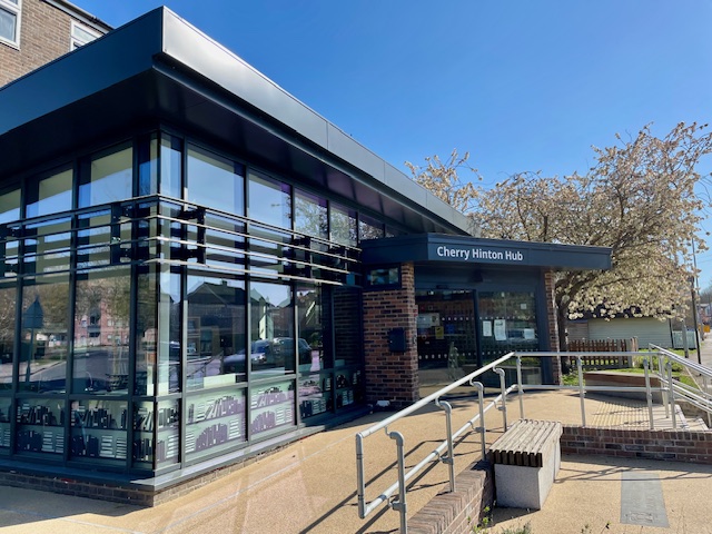
I’ve been helping my colleague Kate with brand design for the new Cherry Hinton Hub. Kate is a trustee of this new community space in the south of Cambridge.
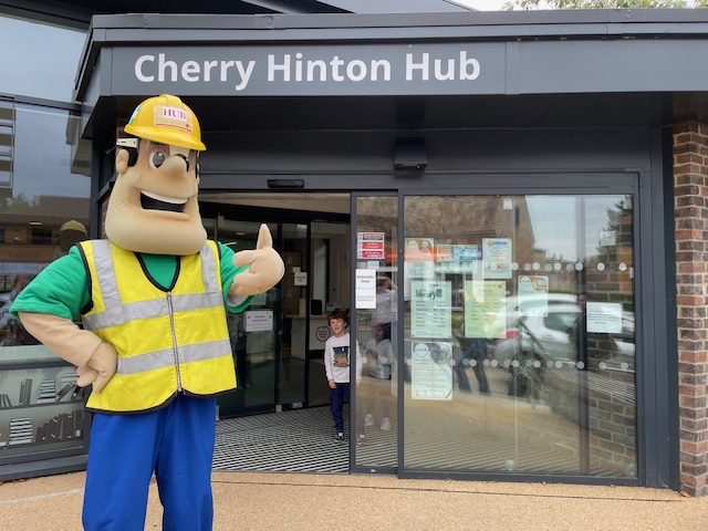
My first introduction to Cherry Hinton Hub was when Kate sent me a panicked message in Slack, saying she had to choose a typeface for the Cherry Hinton Hub signage and had only 36 hours to make a decision.
I was happy to advise her and the deadline was met.
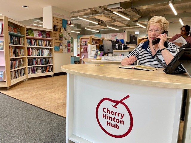
Kate had also been tasked with designing two logos: one for Cherry Hinton Hub and another for the café in the hub called The Cherry Branch. After several frustrating weeks of tinkering in Canva, Kate threw in the towel and decided this part of the project needed a designer.
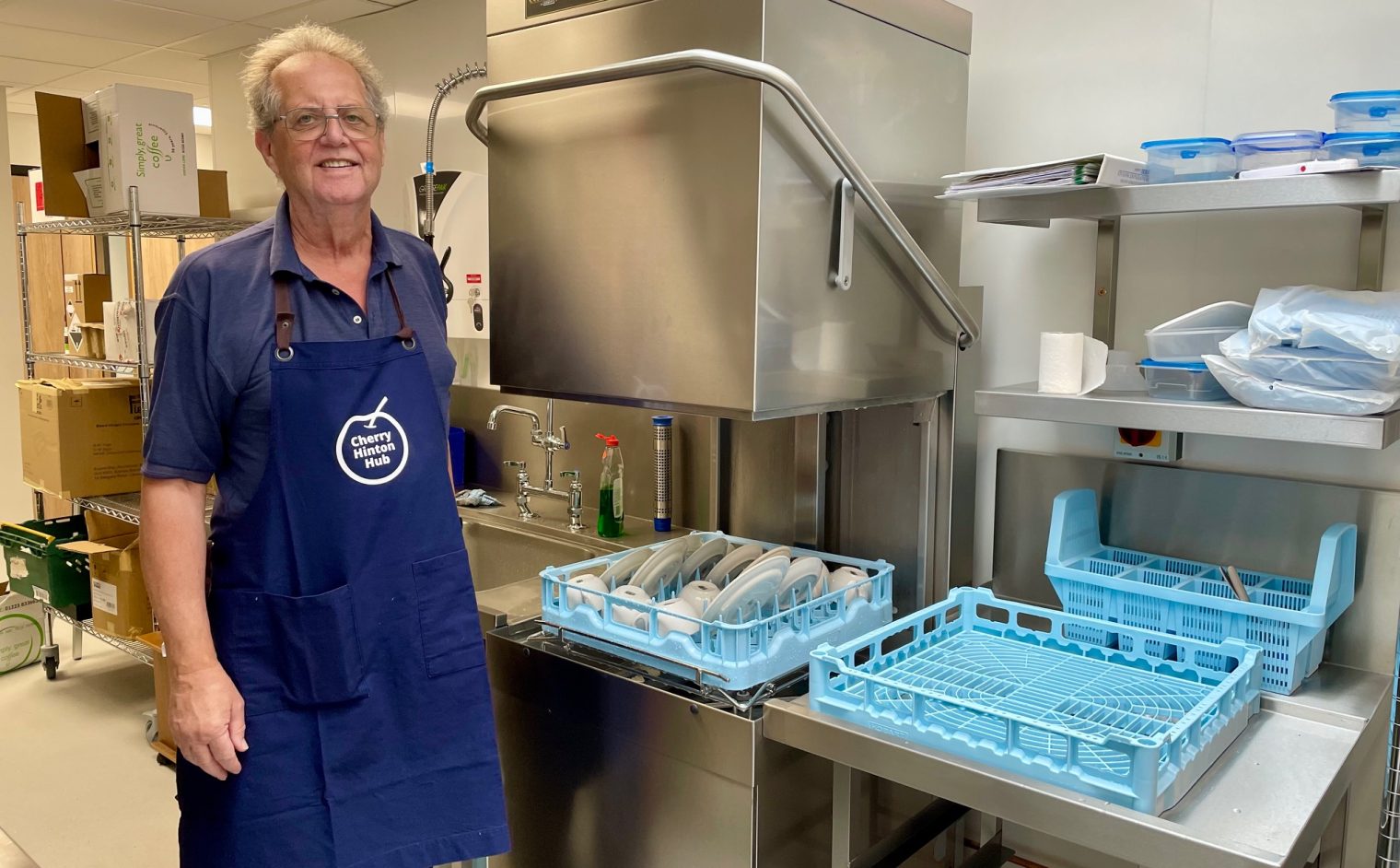
Design colleague to the rescue again! Kate binned her Canva efforts, and we started again. We were looking for something clean, easily readable, and modern that could be used in a variety of ways – from aprons, name badges, and printed publicity, to websites and social media.
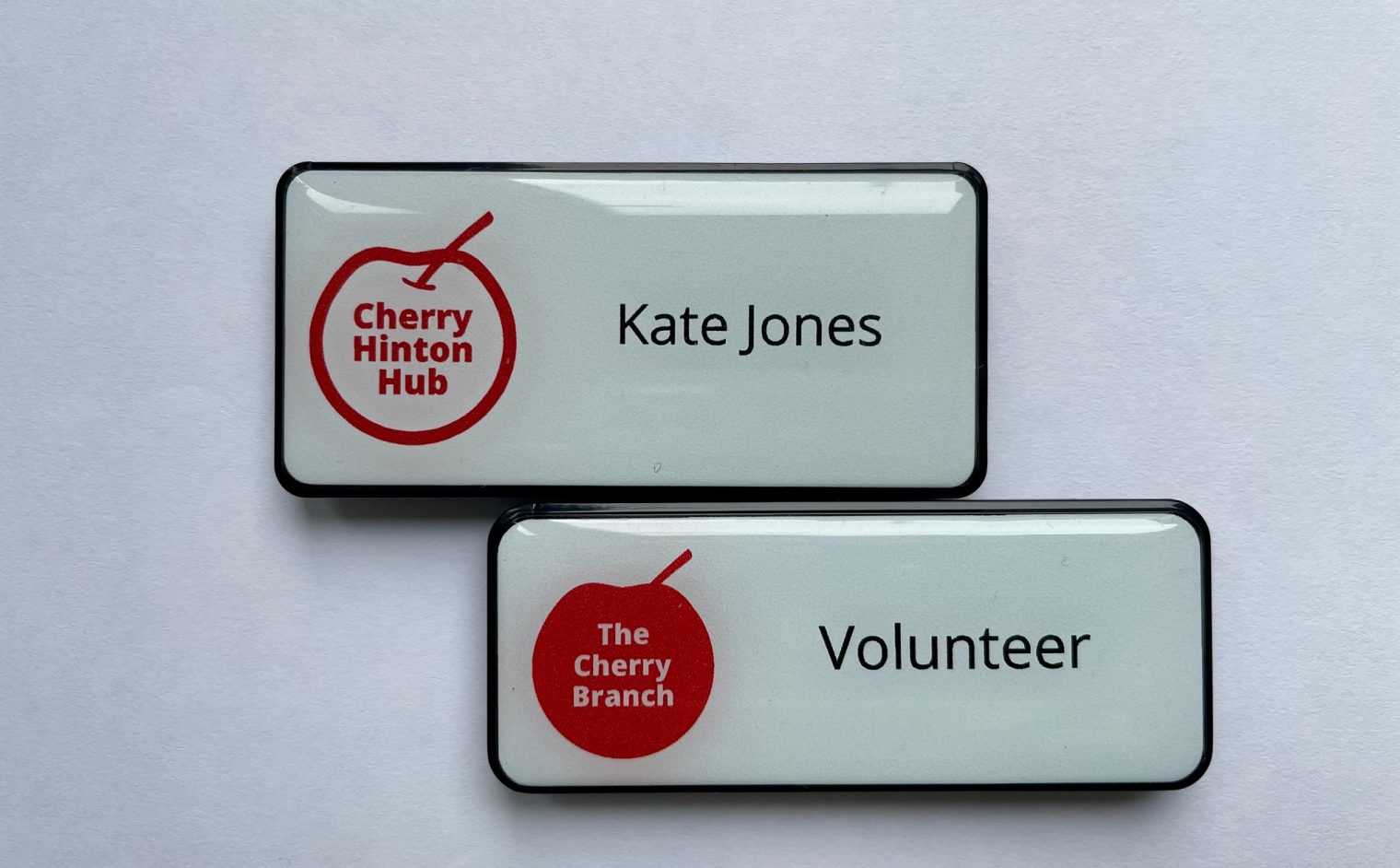
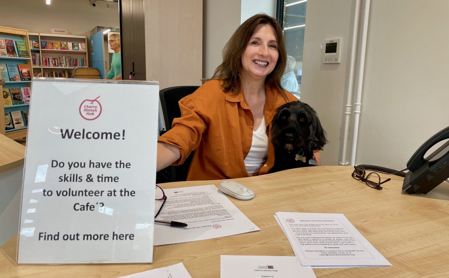
A key feature had to be a cherry. Kate told me that Cherry Hinton is known for its Cherry trees. They were planted all along Cherry Hinton High Street by the Women’s Institute at the end of the Second World War and each tree is a memorial to a life lost.
I designed two versions – the Cherry Hinton Hub logo is an outline of colour and The Cherry Branch logo is a colour-filled version. They complement each other nicely. With a clean, legible design, they work well either in the physical hub or when used online.
I was really pleased to be able to support my colleague and provide a strong brand identity for this new community space.