

It’s something that’s kind of taken for granted these days, having been around for 15 years now. It’s worth taking a brief look back at what the web was like before responsive web design, to understand the impact and appreciate its importance.
A “fixed” web
When I first started my career in web development, it was accepted knowledge that everyone used a monitor with one of two screen resolutions: 800×600 or 1024×768. Everything was designed and built to work for those dimensions, and that was that.
With the web seemingly ‘fixed’ in this way, we could just directly apply all the terminology and techniques from centuries of print design to this new medium. Which is exactly what happened.
These BBC News web pages from 1998 and 2008 are prime examples of web design before responsive web design. Pretty much everything was given a fixed pixel size: text and images as well as the web pages themselves.
But we were kidding ourselves, really. The web has always had the potential to be fluid; we just decided to constrain it.
There’s always been a need for some people to use zoom to make it easier to see what’s on their screen. Web browsers support this, yet zooming a web page “back in the day” was far from an ideal experience.
The Web Content Accessibility Guidelines (WCAG) 1.0 were established in May 1999. They encouraged designing for device-independence, but there was no mention of facilitating zooming. It wasn’t until December 2008, when WCAG 2.0 became an official web standard, that we got a guideline about resizing text up to 200%.
So, how do those archive BBC News pages behave when zoomed to 200%?
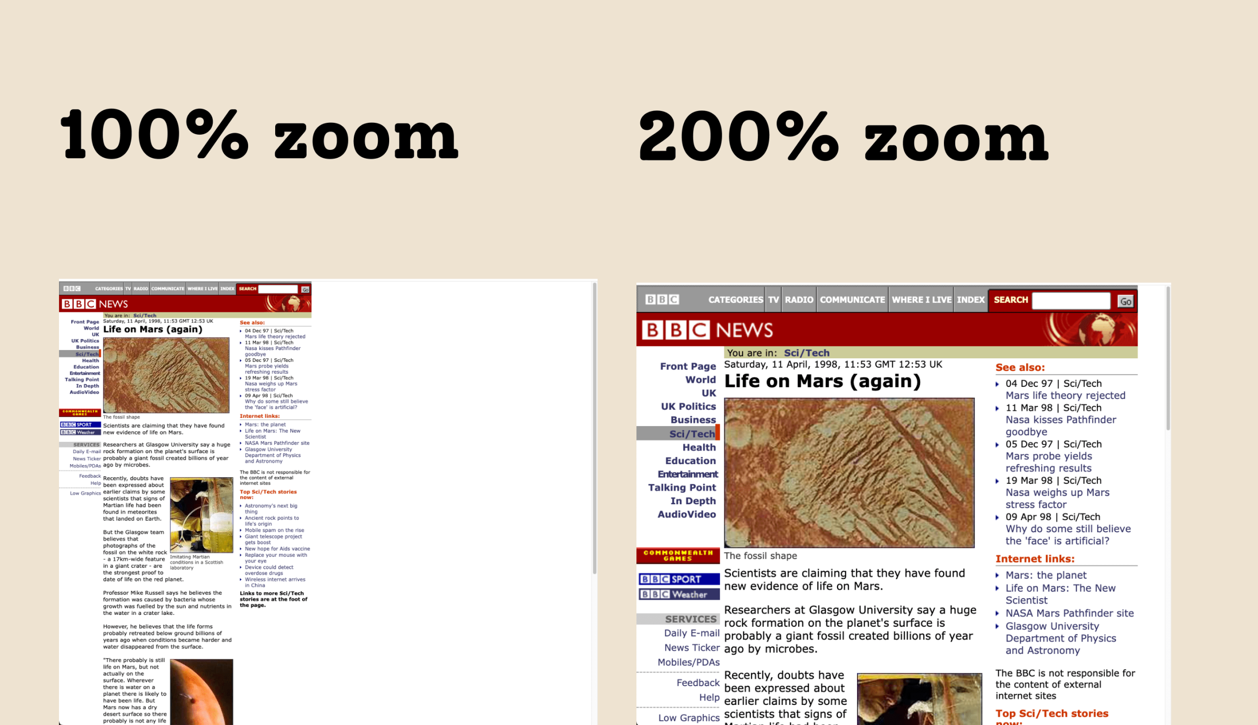
Well, the whole page gets larger, but that’s pretty much it. Everything remains in the same relative positions as before. On the 1998 page, the photos start to become pixelated when zoomed.
On the 2008 page, the content expands beyond the width of the browser window, requiring horizontal scrolling to be able to see all of it. Imagine having to do that on a really long web page with lots of text content. It would become very tiresome, very quickly. Sidenote: it’s not until June 2018 and the advent of WCAG 2.1 that there is an official standard addressing overflowing content.
It’s a world apart from what we have come to expect today. And we should remember that some people need to zoom way beyond 200%.
Fixing the web by making things fluid
So, what prompted the responsive web design revolution?
Access to the mobile web was first commercially offered in 1996, but when the first iPhone launched in 2007, then things really started to take off. With a sophisticated new Safari browser, suddenly the web became this thing that you could carry around with you. Clients wanting a website were starting to ask for a separate mobile website to accompany their “main” website. That was never going to be maintainable.
In 2010, Ethan Marcotte coined the phrase “Responsive Web Design” and wrote an article about it. He explains the process of using a fluid grid for content, flexible images and CSS media queries to create web pages that respond to changes in the size of the browser window – and therefore to different screen sizes on different devices.
Let’s take another look at those archive BBC News pages, and see how they hold up on a mobile screen.
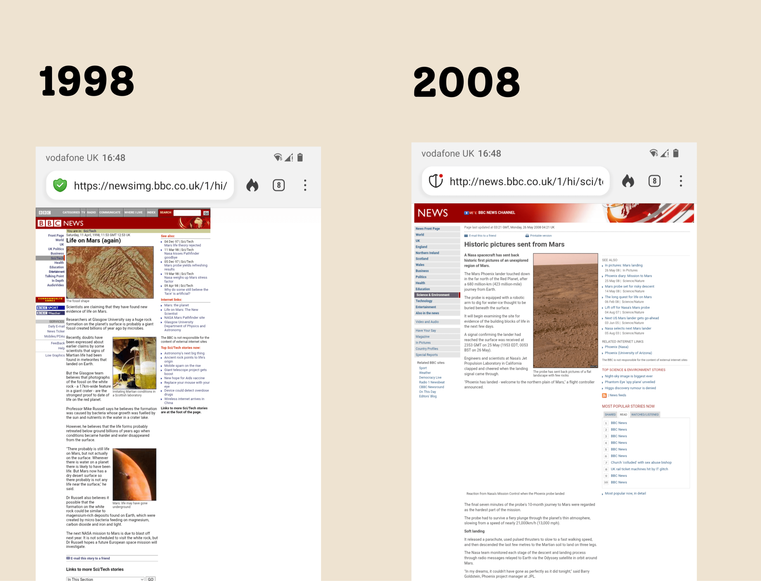
The pages are basically identical to how they appear on a desktop monitor, which isn’t much use when you’re using a screen that fits into the palm of your hand (more or less). Everything is tiny.
Fortunately, thanks to responsive web design, web designers and developers now have the tools to create web pages that look fantastic and work for everybody, no matter the screen size or zoom level in use. Just take a look at this BBC News web page from 2025:
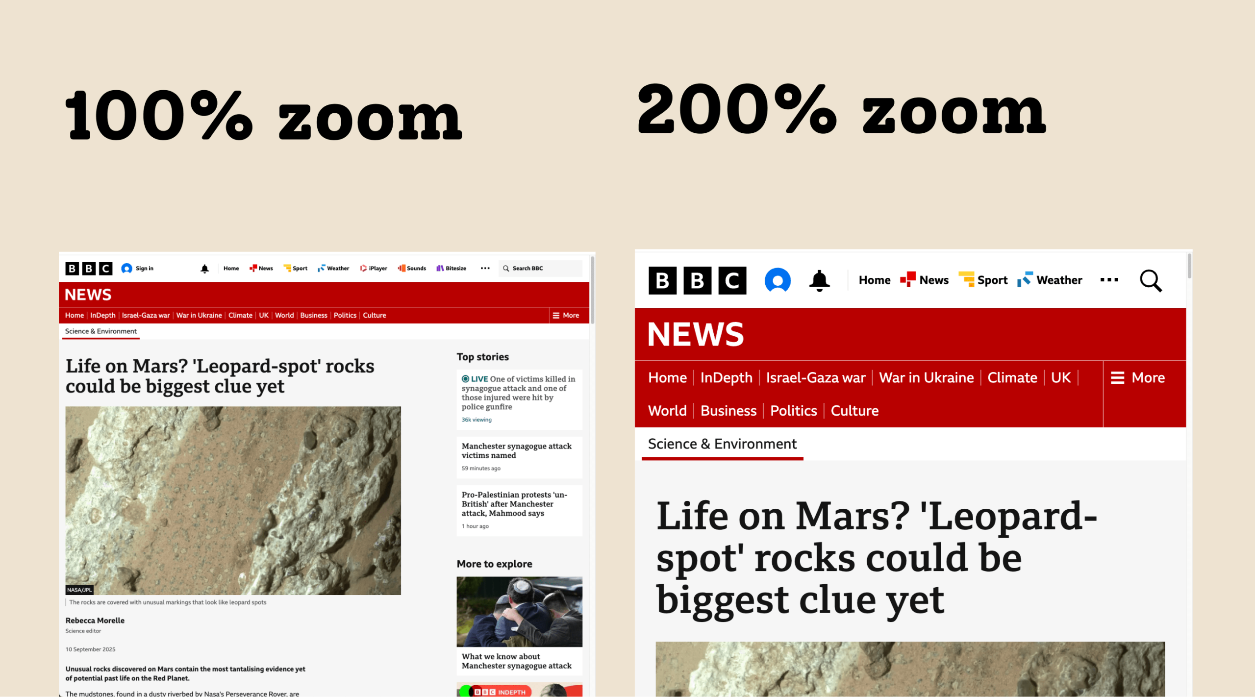
Different regions of the web page can shift their position relative to each other, depending on the screen dimensions. Text remains easy to read, and the flexible images look great across all sizes. You may spot how, at 200% zoom, the web page starts to look a bit like it does on a mobile screen. This is entirely intentional, and saves people from having to scroll both horizontally and vertically to get to all of the web page content.
Nowadays, the tenets of responsive web design are largely common practice for web designers and developers. The crucial aspect is making sure that we test our work at different sizes and zoom levels to make sure that our web pages respond as people need them to.
Our approach to web design
We design for mobile first, which means we focus on communicating your message on small screens first, then scaling up for larger screens. This helps focus on the really important content, and gives great results across any device; mobile, desktop and in-between. Get in touch for a chat about your next project.