
About the client
The Mapping the Arts and Humanities Project is based in the School of Advanced Study at the University of London, and was commissioned by the Arts and Humanities Research Council and Research England.
About the project
Arts and humanities research happens in a lot of places. Unlike science, which has a more formal and visible structure of labs and facilities, it is hard for researchers and research funders to see where research is happening.
This website project is about making UK arts and humanities research more visible, so it can be effectively found, connected and invested in.
The Arts and Humanities Research Council and Research England commissioned the School of Advanced Study (University of London) to gather data about the vibrant arts and humanities research happening in the UK. They wanted to publish it on a website, with an interactive map, a searchable database and an application programming interface (API). Then they hoped to invite the research community to use, maintain and add to the website.
Studio 24 designed and built the website.
Project goals
- Design something new – present a new concept in a clear and engaging way
- Interactive map – an interactive map showing UK arts and humanities infrastructure
- Accessible design – the design must consider accessibility
- API and dashboard demo – make the data publicly available and demonstrate how it might be used
- Community engagement – support the client to invite the research community to get involved

Working with Studio 24 was a truly collaborative experience.
The Studio 24 team provided valuable input on the data structure and design and functionality of the website that was invaluable.
Without their intellectual investment in this project, the result would not be nearly as cohesive and functional.
Design something new
We designed a bold and vibrant look with generous space and type sizes to make the project easy on the eye.
A blue primary colour with highlights of electric pink and neutral long-form pages makes the project feel contemporary and approachable, but also allows for some dense information on the infrastructure detail pages.
This was a new website concept and we needed the design to present the new idea while being engaging.
I designed the website to be compelling and simple enough for people to sign up and add to the project. We want them to be proud to have their research infrastructure included on the site.

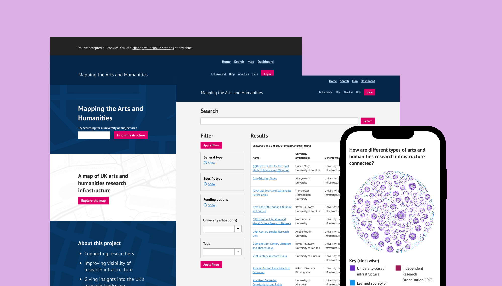
Interactive map
We created an interactive map with pins marking research infrastructure locations, linking to the details of the infrastructure.

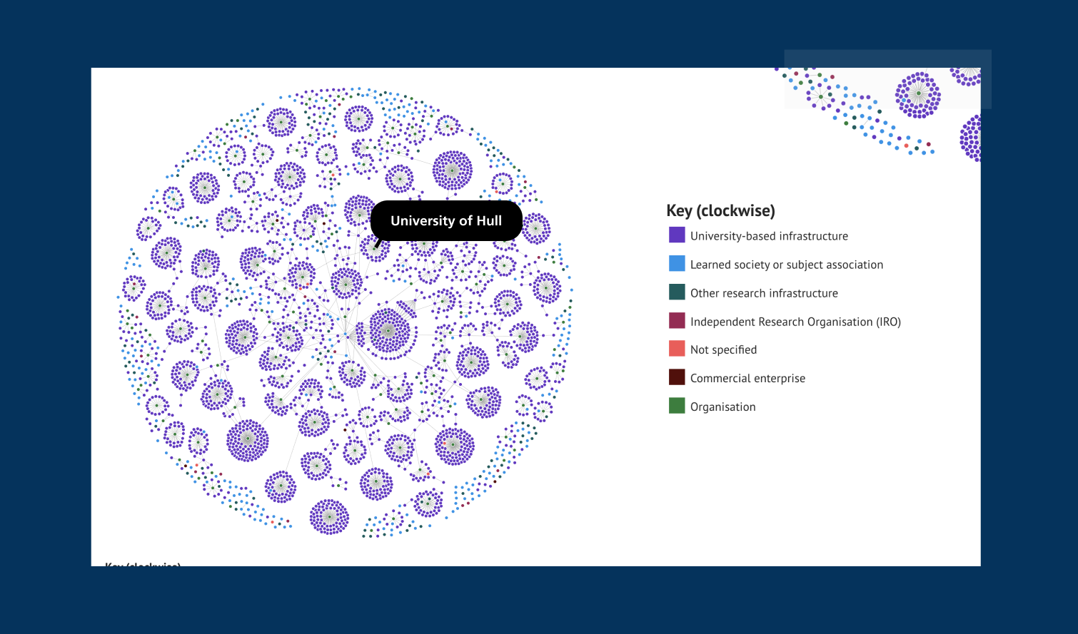
API and dashboard demo
We created a public API so the data can be used more widely and in different ways.
We made a dashboard demo page to show what can be created using the data the website collates and makes available.
The idea of the dashboard is to inspire users with some fast loading examples using real data.
Accessible design
It was important that the project could connect and be used by the whole of the research community. We carefully designed a colour palette which gave us vibrancy and good colour contrast.
We paid attention to using simple language and explanation where possible.
We designed and developed the site for compliance with W3C WAI Web Content Accessibility Guidelines (WCAG) 2.1 Level AA.
Community engagement
The UoL project team spent months gathering public data and then wanted to invite people to maintain their data on this new website.
We provided support while thousands of potential contributors were emailed to ask to join the project.
We also considered ongoing support for the project team, like notification functionality to email community editors if they’ve not reviewed their entry for a year or so.

Working with Studio 24 was the best kind of partnership. The Mapping the Humanities website is a genuine co-creation, as our original ideas evolved and improved in dialogue with the team.
Studio 24 has such a productive approach to project management and delivery, combining openness and responsiveness with a clear focus on the end goal.
We’re not just happy with the final product but with the whole process.