
We came across some of our old branding. Join us on a quick trip down memory lane!
Where did the name Studio 24 come from? There were a few ideas behind it:
- The ‘studio’ is because web design is creative
- The word ‘studio’ is also the same in many European languages so we liked the international feel it had
- The ’24’ refers to the fact that the web is at your disposal 24 hours a day. Coincidentally, Simon was 24 years old when he founded the agency!
The international feel is also the reason we registered .net rather than a .uk or .com domain. Simon felt our work is for everyone and could be international, something we’re now doing with clients like W3C and CBM.
As you might expect, there has been an evolution of our logo over 20 years and it’s partially linked to the evolution of the web.
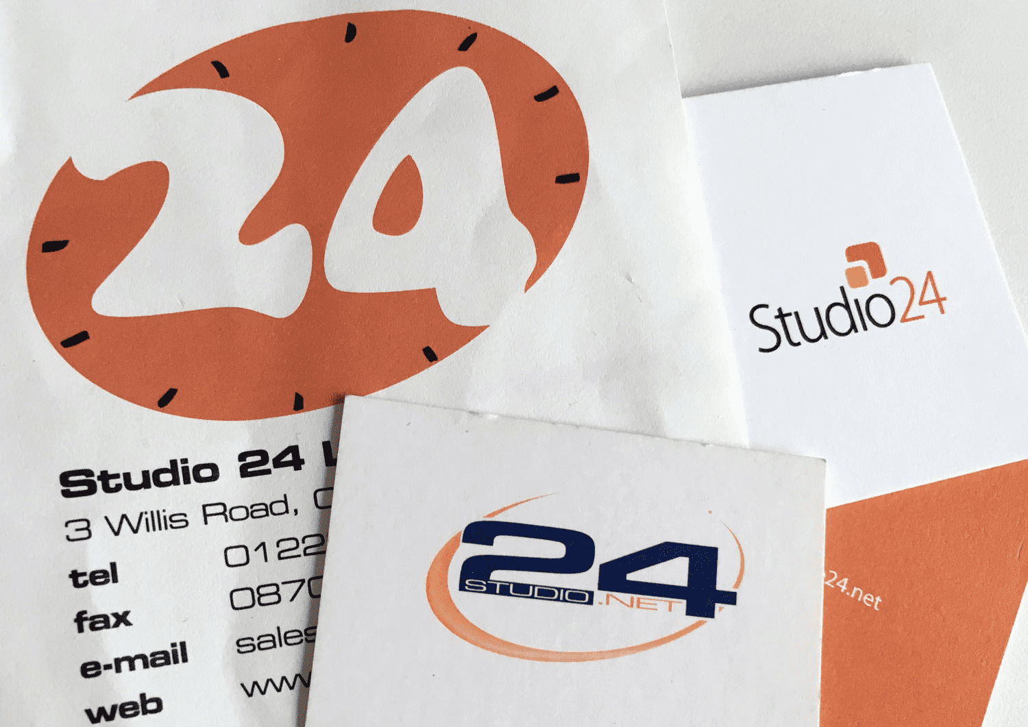
Simon designed the clock logo himself in Photoshop! We didn’t use that logo for very long, but the orange endured for 19 years. We even painted our office at St Stephen’s place orange. We really like orange! It’s amusing to think we had letterhead and it includes a fax number. We are a paperless office now.
The second logo – the swoosh logo – was a modernising of the clock idea and a nod to the global nature of the web. This time designed by a professional designer, Adam Cash of Touch of Ginger. We had this logo when we were based at Hope Street Yard in Mill Road.
We then took our branding back in-house. We moved from Hope Street Yard to St Stephen’s Place and the logo moved from circles to squares. This third logo represents both a thought cloud and also the advent of responsive design – with websites needing to work on different size screens. But still orange!
We introduced our current logo in 2018 and finally replaced the orange with black. It’s simple, clean, and readable – a reflection of the accessible design at the heart of our work.
So there you have it, a potted history of Studio 24 branding!