
We have worked with CJBS for many years now on a whole array of projects, the most recent of which was the Cambridge Risk Framework, which they have been using to visualise data in their latest venture with Lloyd’s.
The event, hosted at the top of the fascinating Lloyd’s building in London, was a presentation about the Lloyd’s City Risk Index, a project that aims to collect data on 301 major cities around the world and model their potential financial risk from a selection of 18 categories of possible catastrophes, ranging from cyber attacks and market crashes to pandemics and solar storms. The teams at Lloyd’s and the Centre for Risk Studies collected vast amounts of data about city infrastructures and past catastrophes and used that information to calculate their vulnerability to potential catastrophes in the future.
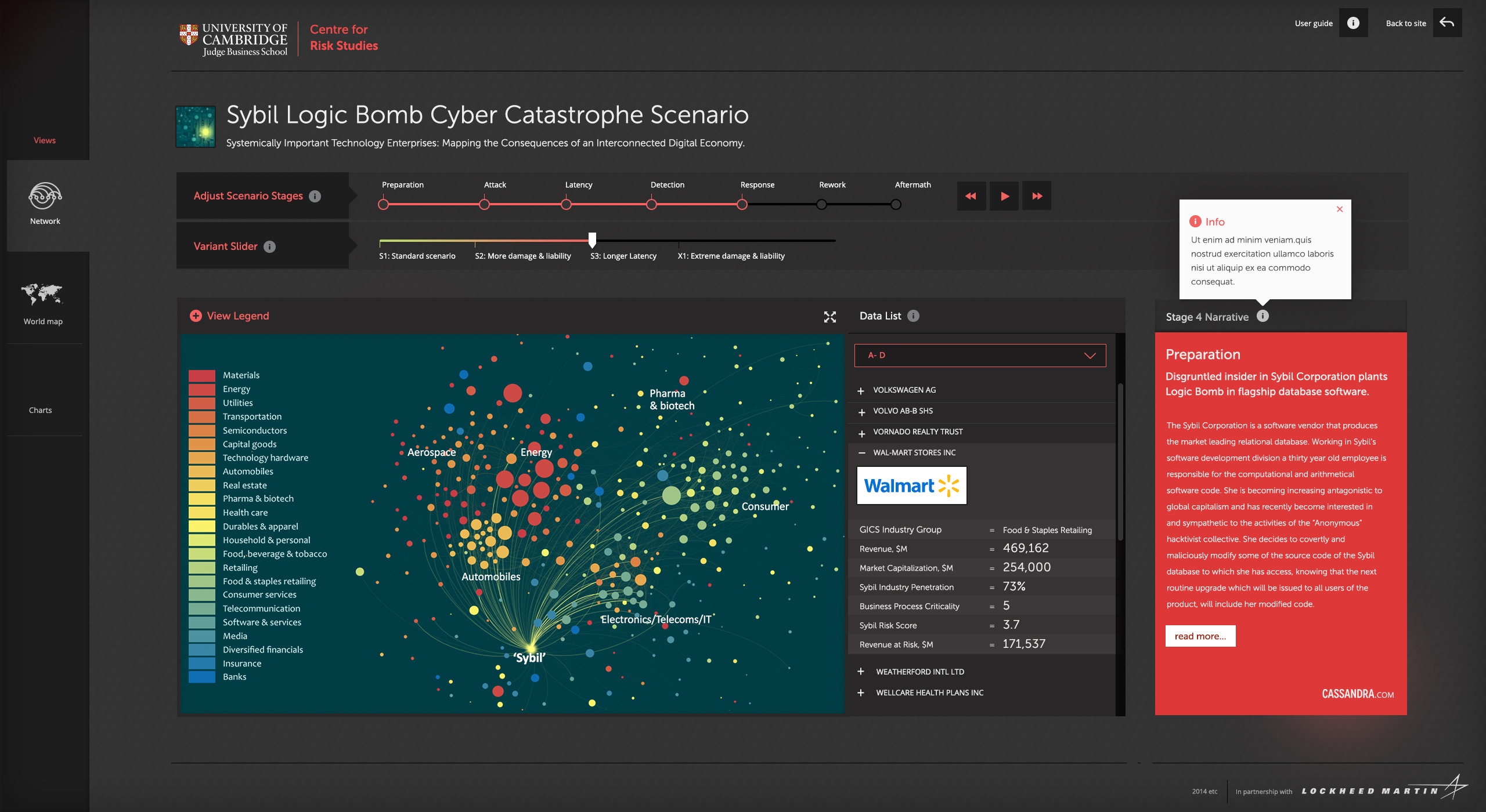
This kind of data could be extremely valuable for insurance groups, businesses and governments. However, the data on its own is almost impossible to interpret. We know, they showed us a tiny fraction of it and it nearly melted our brains! This is where the Cambridge Risk Framework comes in.
The Cambridge Risk Framework is a web-based visualisation tool that allows users to navigate and analyse data about potential catastrophes in cities around the world, comparing their potential risk using various metrics (in this case the GDP at risk from a catastrophe). It was an interesting challenge, as the data had already been computed by the Cambridge Risk Studies group so we had to create a standalone web application that connects with their data services and visualises the key information using maps and graphs.
The risk analysis data was calculated by the Centre for Risk Studies and exposed though a public API, meaning that we didn’t need to store or generate any of the data. Instead, we needed to connect with the data service, which provided each section of data in JSON format, then visualise it on screen. Knowing there would be multiple catastrophe scenarios, we used Angular JS as a framework to power the application, which allowed us to set up a hierarchy of routes that mapped to the API. We then built custom visualisations using a combination of data visualisation libraries such as D3 and Leaflet for the mapped sections. It has been an incredibly interesting project to work on and it was great to see it in context at the Lloyd’s event. And the view wasn’t bad either.
Key frameworks used: