
If the contrast is too low then people with vision problems will struggle to distinguish and understand the content being presented to them.
Colour blindness may spring to mind, but many other eye conditions can lead to colours appearing faded and objects blending into the background. In such cases, low contrast text content becomes too hard to read; low contrast user interfaces become unusable.
Understanding colour contrast requirements
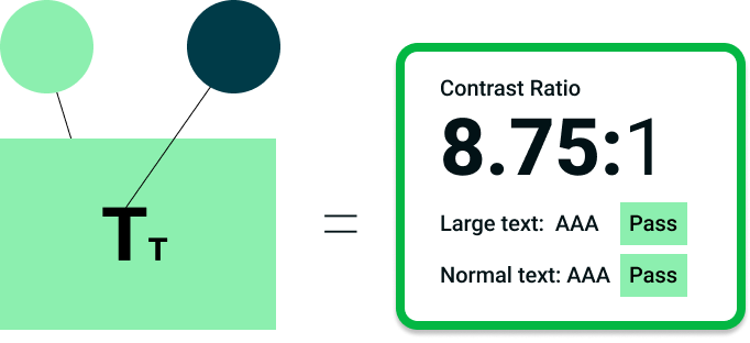
Before thinking about specific colours it’s important to consider colour contrast, which is the difference in brightness between two colours. It’s measured as a ratio; white text on a white background will have a contrast ratio of 1:1.
The Web Content Accessibility Guidelines (WCAG) specify minimum ratios for colour contrast. These guidelines can be summarised as follows:
Text
- At least 4.5:1 between text and background colours where the font size is (strictly) smaller than 24px, or 19px and bold
- At least 3:1 between text and background colours where the font size is larger than (or equal to) 24px, or 19px and bold
Non-text elements
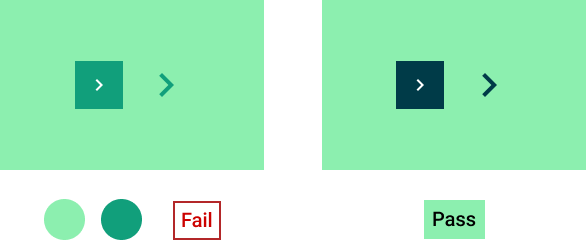
Think user interface components (e.g. buttons, icons, form inputs and other controls with a distinct function) and states (e.g. hover, focus), and parts of graphics required to understand the content (e.g. graphs and charts). Here the requirement is a contrast ratio of at least 3:1 between adjacent colours.
Can there be too much contrast?
Yes. Contrast ratios are a spectrum with ideal values existing within an optimal zone in the middle. For text contrast, I have seen web accessibility professionals cite an optimal range of between 7:1 (higher than the absolute minimum specified by WCAG) and 15:1.
Pure black text on a white background (and vice versa) has a contrast ratio of 21:1. This level of contrast can cause eye strain and headaches, and can even create the appearance of the text appearing to vibrate for some people.
Checking colour contrast
Now that we understand the concept of colour contrast and what ratios we should be aiming for, we need a way of measuring it.
Checking web pages for contrast issues
Any of the following automated tools for checking web page accessibility should flag if there are colour contrast issues present:
- WAVE browser extension for Chrome, Firefox and Edge
- Axe DevTools browser extension for Chrome, Firefox and Edge
- IBM Equal Access Checker browser extension for Chrome, Firefox and Edge
- TPGi ARC Toolkit browser extension for Chrome and Firefox
- Microsoft Accessibility Insights
Measuring contrast ratios for specific colour combinations
The Colour Contrast Analyser is available as a download for Windows, macOS and Linux. It features an eye dropper for selecting background and foreground colours, which can be used with web pages, PDFs, slide decks etc, but you can also copy and paste colour values into it.
The WebAIM Contrast Checker is an online tool that works in a similar way to the colour contrast analyser. It is also available as a bookmarklet that can be added to your browser toolbar.
Contrast Checker can check the contrast of text against an object background, e.g. a button, and check the contrast of the object background with the page background.
There is also a tool for checking the contrast of text on a background image, where the background colour can vary significantly across different parts of the image.
With all of these tools, if the combination you are working with is flagged as inaccessible you will need to play with the settings to find an alternative. The following tools will suggest alternative colours or offer fixes for you, based on your starting options:
If you are trying to generate a colour palette from a range of colours, check out this accessible color palette builder, which will create a matrix from up to six different colours and quickly identify which combinations do not have enough contrast.